Perigee Hall & Gallery(페리지 홀 & 갤러리) 브랜딩
2012
2012
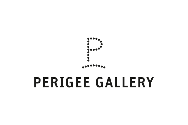
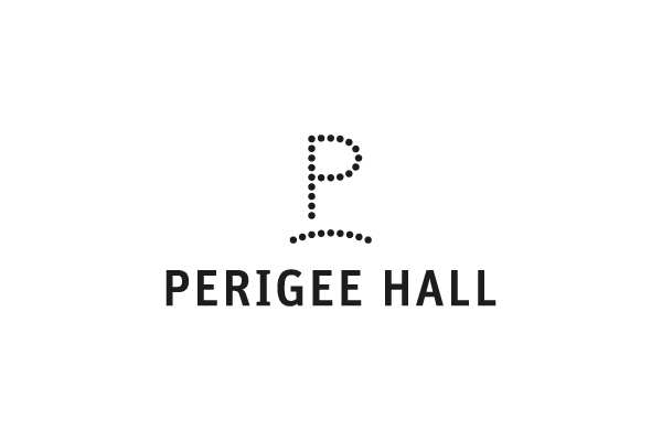
Perigee는 서로 다른 궤도를 돌고 있는 지구와 달이 가장 가까워지는 근지점을
뜻하는 단어로, 페리지 홀 & 갤러리가 문화예술을 통해 관객과 가까워지고자 하는
바램을 담고 있다. 로고는 P가 궤도에 다가가고 있는 모습을 제시하고, 적용
매체는 근지점을 다양하게 해석하였다.
Identity designed for Perigee Hall & Gallery, located in Seoul, Korea. A perigee is the closest point between the earth and the moon orbiting their own different trajectories. The logo was designed representing the concept of moon, space, and orbit as the name of the place suggests. It also reflects closeness and approach embracing Perigee's philosophy.
Identity designed for Perigee Hall & Gallery, located in Seoul, Korea. A perigee is the closest point between the earth and the moon orbiting their own different trajectories. The logo was designed representing the concept of moon, space, and orbit as the name of the place suggests. It also reflects closeness and approach embracing Perigee's philosophy.